
The Box Model
The four box areas
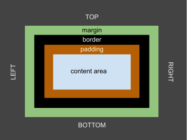
Each box nests four regions: content, padding, border, and margin.
- Content — where text or media actually renders. Sized by
width/height(depending on the sizing model, below). - Padding — inner spacing; the element's own background shows through it.
- Border — the visible edge; it has width, style, and color, and sits outside the padding.
- Margin — outer spacing; always transparent, pushes neighbors away, and collapses with adjacent margins (see the margin-collapse section).
Seeing the boxes
The fastest way to learn the model is to draw it: open dev tools, select any element, and read the
box-model diagram at the top of the Computed pane. The temporary
outline: 2px solid lime debugging habit also works — outlines do not affect layout, so you
can spray them over a page to reveal box boundaries without changing anything.
/* Debugging trick: outlines never shift layout (unlike borders) */
.debug * { outline: 2px solid lime; }
Sizing models: content-box versus border-box
The default surprise
By default (box-sizing: content-box), width sizes the content only.
Add padding and border and the rendered box grows beyond the width you wrote — the classic "why is my
320px card actually 354px" bug.
/* content-box (the default): rendered width = width + padding*2 + border*2
   .card below renders at 320 + 16 + 2 = 338px wide */
.card-cs {
  width: 320px;
  padding: 8px;
  border: 1px solid #334155;
}

/* border-box: width INCLUDES padding and border - renders at exactly 320px.
   This is what almost everyone wants, so it is applied globally. */
.card {
  box-sizing: border-box;
  width: 320px;
  padding: 8px;
  border: 1px solid #334155;
}
The standard reset
/* Make border-box the default for every element and pseudo-element.
   Pseudo-elements are boxes too - leaving them out reintroduces the bug. */
*, *::before, *::after { box-sizing: border-box; }
Spacing with purpose
A spacing scale, not random numbers
Ad-hoc pixel values drift (8, 10, 12, 15…). A small token scale keeps rhythm and makes global changes one-line edits. Define the scale once and reference it everywhere:
:root {
  --space-1: 0.25rem;  /* 4px equivalent: tight, inside components */
  --space-2: 0.5rem;   /* icon-to-label, chip padding */
  --space-3: 1rem;     /* default component padding */
  --space-4: 1.5rem;   /* between related blocks */
  --space-5: 3rem;     /* between sections */
}

.card { padding: var(--space-3); }
.section { margin-block-start: var(--space-5); }
Margins collapse — and padding never does
Vertical margins between sibling blocks merge: a 2rem bottom margin next to a 3rem top margin
yields a 3rem gap, not 5rem. Parent–child margins collapse too, which is why a first child's top margin
can "escape" its parent entirely. Gaps between flex or grid items never collapse — one more reason the
layout lessons prefer gap. See it happen in
demo/box-and-text/10_margin_collapse.html.
/* Predictable spacing between stack children: use gap, not margins */
.stack { display: flex; flex-direction: column; gap: var(--space-3); }
Logical properties
Direction-agnostic spacing
margin-left assumes left-to-right writing. Logical properties name the edges relative
to the text flow instead — inline-start/inline-end for the reading
direction, block-start/block-end for the line direction. For Arabic or Hebrew
layouts, a logical stylesheet mirrors itself automatically.
/* Physical: breaks in RTL layouts */
.card { margin-left: 1rem; padding-right: 1rem; }

/* Logical: correct in every writing mode */
.card { margin-inline-start: 1rem; padding-inline-end: 1rem; }
Layout tools (a preview)
| Tool | Best for | Starter property |
|---|---|---|
| Normal flow | Documents: block elements stack, inline content wraps | (nothing — it is the default) |
| Flexbox | One-dimensional alignment (a row or a column) | display: flex; |
| Grid | Two-dimensional page sections and component grids | display: grid; |
| Positioning | Badges, overlays, anchored UI | position: relative/absolute; |
These get full lessons of their own — Display, Flow and Positioning, Flexbox, and CSS Grid. The box model you just learned is the substrate for all of them: flex and grid algorithms position boxes; they do not change what a box is.
Practice: debug the box
The task
Open demo/box-and-text/09_box_model.html and predict each rendered width from the
declarations before measuring with dev tools. Then fix a broken card in
demo/box-and-text/10_margin_collapse.html using only spacing concepts from this lesson.
The checklist
- Switch a card between
content-boxandborder-boxand predict the rendered width both times. - Replace a collapsing-margin gap with
gapand confirm the spacing stops changing when you reorder children. - Convert one physical margin to its logical equivalent and check the page in
dir="rtl".