
Flexbox
The container and its axes
Two axes, not four sides
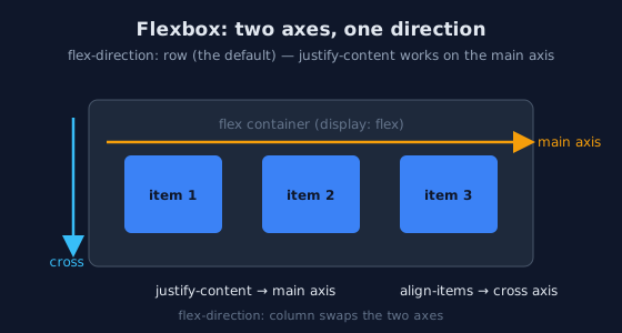
justify-content works along the main axis, align-items across it. flex-direction: column swaps them./* The container declares flexbox; everything else keys off its axes */
.nav {
display: flex;
flex-direction: row; /* main axis = horizontal (the default) */
justify-content: space-between; /* distribute along the MAIN axis */
align-items: center; /* align across the CROSS axis */
gap: 1rem; /* spacing BETWEEN items - replaces margin tricks */
}
The single most useful habit: think in axes, not in horizontal/vertical. When
flex-direction: column, justify-content becomes vertical — the property did not
change meaning, the axis did. This one insight resolves most flexbox confusion.
Wrapping is opt-in
/* A flex row NEVER wraps by default: items shrink or overflow instead.
   For a responsive card row without media queries: */
.card-row {
  display: flex;
  flex-wrap: wrap;
  gap: 1rem;
}
.card-row > * {
  flex: 1 1 16rem;   /* each card: at least 16rem, may stretch to share the row */
}
Flex items: growing and shrinking
The flex shorthand reads: grow, shrink, basis
/* flex: <grow> <shrink> <basis>
   basis  = the ideal size before free space is shared
   grow   = share of EXTRA space (0 = never grow)
   shrink = willingness to shrink below basis (default 1) */
.sidebar { flex: 0 0 16rem; }   /* fixed rail: never grows, never shrinks */
.content { flex: 1; }           /* takes ALL remaining space (basis 0%, grow 1) */
.card    { flex: 1 1 16rem; }   /* ideal 16rem, grows and shrinks with siblings */
Grow factors distribute proportionally, not absolutely. Two items with flex: 1
split the free space evenly; flex: 2 takes twice as much of the extra space, not
twice the total width. Keeping that distinction straight prevents most "why is my column wider"
surprises.
The auto-margin trick
/* justify-content spreads ALL items; a single auto margin absorbs
   all free space on ONE side - the "push the last item right" idiom */
.nav { display: flex; gap: 1rem; }
.nav .login { margin-inline-start: auto; }
The patterns you will use daily
The media object
/* Icon + text, icon stays put, text wraps within its own column */
.media { display: flex; gap: 0.75rem; align-items: flex-start; }
.media .icon { flex: 0 0 auto; }     /* never grows, never shrinks */
.media .body { min-width: 0; }       /* allows the text to shrink and wrap */
.media .title { overflow-wrap: anywhere; } /* long words cannot push the layout out */
Perfect centering and the sticky footer
/* The entire "how do I center a div" answer */
.center {
  display: flex;
  justify-content: center;  /* main axis */
  align-items: center;      /* cross axis */
  min-height: 12rem;
}

/* Sticky footer: page fills the viewport, footer pinned to the bottom */
body {
  display: flex;
  flex-direction: column;
  min-height: 100dvh;   /* dynamic viewport height: correct on mobile */
}
main { flex: 1; }        /* the content area absorbs the free space */
Equal-height cards and the gap habit
/* stretch (the default align-items) gives equal heights for free;
   the CARD is a flex column so its footer can be pushed to the bottom */
.card-row { display: flex; gap: 1rem; }
.card {
  display: flex;
  flex-direction: column;
}
.card .actions { margin-top: auto; }  /* aligned across cards of different text length */
Flexbox or Grid?
A rule of thumb, with exceptions
Flexbox for content-driven one-dimensional groups: the number of items is unknown, items size themselves. Grid for layout-driven two-dimensional structures: rows and columns are declared regardless of content. Components routinely mix them — a grid page shell containing flex toolbars containing flex media objects.
Practice: flex workout
The task
Open demo/layout/15_flexbox_patterns.html from the
Lab Examples page and rebuild each pattern from memory.
The checklist
- Build a toolbar: brand left, links center-right, login pushed fully right with one auto margin.
- Build a card row that goes 3 → 2 → 1 columns by resizing, with no media query.
- Explain the difference between
flex: 1andflex: 0 0 autoon a sibling pair. - Center a box in a viewport-height section using
dvh, then shrink the window to verify it never overflows.