
CSS Grid
Tracks and the fr unit
Columns and rows are tracks
/* A two-column shell: 16rem rail, fluid rest */
.layout {
  display: grid;
  grid-template-columns: 16rem 1fr;  /* fr = share of the space LEFT after fixed tracks */
  gap: 1rem;                          /* one declaration spaces rows AND columns */
}

/* repeat() avoids repetition; minmax() bounds a track */
.gallery {
  display: grid;
  grid-template-columns: repeat(3, minmax(0, 1fr));  /* 3 equal columns that CAN shrink */
  gap: 1rem;
}

/* auto rows: implicit rows get this height - useful for card walls */
.gallery { grid-auto-rows: 10rem; }
fr is not "one fraction of the container" — it is a share of the space remaining after
fixed-size tracks and gaps. 16rem 1fr gives the rail exactly 16rem; the content column gets
everything else. minmax(0, 1fr) instead of plain 1fr lets a column shrink below
its content's minimum width — the grid cousin of the min-width: 0 idiom.
Template areas: layout as a picture
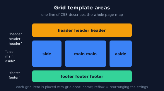
grid-template-areas draws the page as a map; each item claims its region with grid-area, and responsive redesigns become string edits./* The layout as ASCII art - each quoted string is one row */
.page {
display: grid;
grid-template-areas:
"header header header"
"side main aside"
"footer footer footer";
grid-template-columns: 12rem 1fr 10rem;
grid-template-rows: auto 1fr auto;
min-height: 100dvh;
}
.page > header { grid-area: header; }
.page > nav { grid-area: side; }
.page > main { grid-area: main; }
.page > aside { grid-area: aside; }
.page > footer { grid-area: footer; }
/* The SAME page on mobile: reorder without touching the markup */
@media (max-width: 48rem) {
.page {
grid-template-areas:
"header"
"main"
"side"
"aside"
"footer";
grid-template-columns: 1fr;
}
}Responsive grids without media queries
The auto-fit card wall
/* The most reused grid pattern in modern CSS:
   "as many 16rem columns as fit, share the rest evenly" */
.cards {
  display: grid;
  grid-template-columns: repeat(auto-fit, minmax(16rem, 1fr));
  gap: 1rem;
}
/* No media queries: the browser re-counts the columns as the
   viewport grows and shrinks. Resize the demo to watch it happen. */
auto-fill and auto-fit differ only when there are fewer items than columns:
auto-fill keeps empty tracks (items stay left-aligned at their minimum), while
auto-fit collapses the empty tracks so items stretch. For card walls,
auto-fit is usually what you want.
Placing items by line or by area
/* Line numbers count from 1 at the top/left; -1 is the last line */
.feature { grid-column: 1 / -1; }        /* span ALL columns */
.stat    { grid-row: span 2; }           /* tall stat card */
/* Explicit placement - the basis of overlapping, revealed layouts */
.overlay { grid-area: 1 / 1; }           /* same cell as .photo: they overlap */
.photo   { grid-area: 1 / 1; }
Alignment, familiar from flexbox
/* Same axis idea as flexbox, applied to the grid:
   justify-* = inline (row) axis, align-* = block (column) axis */
.gallery {
  align-items: start;        /* items shrink to content height, not full row */
  justify-items: stretch;    /* default: fill the column */
  place-items: start center; /* shorthand for both */
}
Grid or flexbox?
Decide by dimension, then by author
| Question | If yes | If no |
|---|---|---|
| Do items align in two dimensions? | Grid | Flexbox |
| Should the structure exist even when empty? | Grid | Flexbox |
| Is item count unknown and content-driven? | Flexbox (or auto-fit grid) | — |
The honest answer for a component is often "both": a grid shell for the sections, flex inside each
section. Naming the outer container display: grid does not prevent inner flex containers.
Practice: grid workout
The task
Open demo/layout/16_grid_patterns.html from the
Lab Examples page and rebuild each pattern from memory.
The checklist
- Build the card wall with
auto-fitand no media queries; count the columns at 400px, 800px, and 1200px. - Rearrange the template-area page for mobile by editing only the strings.
- Span one "feature" card across all columns without adding a class to it.
- Overlap a caption onto a photo using two
grid-area: 1 / 1items.