
Display, Flow and Positioning
display property. Most "layout bugs" are flow behaving exactly as specified — this lesson
gives you the model to predict it, plus position for the cases flow cannot express.
Normal flow
Block boxes and inline boxes
In normal flow, block boxes stack vertically and fill the available width; inline boxes
flow along a text line, wrap, and ignore width and height. Paragraphs, headings, and divs are block by
default; spans, links, and emphasis are inline. That is the entire mental model — and the reason a
width on a span silently does nothing.
The display property controls it all
/* display changes HOW an element participates in flow */
a.cta { display: inline-block; }  /* inline placement, box sizing: the "button link" */
img.avatar { display: block; }    /* center a lone image with margins */
nav.hidden { display: none; }     /* not rendered at all: no space, no events */

/* Two-value syntax says exactly what you mean:
   "be a flex container from the outside, a block from the inside" */
.card { display: block flex; }| Value | Outer role | Inner role | Typical use |
|---|---|---|---|
block | block | flow | Sections, paragraphs |
inline | inline | flow | Text-level emphasis, links |
inline-block | inline | flow | Inline elements that need size |
flex | block | flex | Rows and columns of items |
grid | block | grid | Two-dimensional layout |
none | removed from rendering entirely | Toggling, conditional UI | |
position: the five behaviors
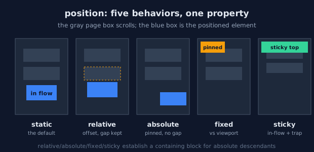
position values: static is the default, relative offsets without leaving flow, absolute escapes to its nearest positioned ancestor, fixed pins to the viewport, sticky is flow with a trap.Offsets only work on positioned elements
/* static (default): top/right/bottom/left are IGNORED */
/* relative: offset from where the box WOULD be; the original space stays reserved */
.badge-nudge { position: relative; top: -4px; }

/* absolute: positioned against the nearest positioned ANCESTOR.
   The classic container pattern: the parent must opt in. */
.avatar-frame { position: relative; }
.avatar-frame .badge { position: absolute; top: 0; right: 0; }

/* fixed: relative to the viewport - ignores scroll AND ancestors
   (unless an ancestor transforms/filters it: a containing-block trap) */
.back-to-top { position: fixed; inset-block-end: 1rem; inset-inline-end: 1rem; }

/* sticky: normal flow until it crosses the threshold, then it pins - in place */
.table-head { position: sticky; top: 0; }
position: absolute removes the box from flow — siblings close up the space. If an absolutely
positioned element lands somewhere unexpected, the usual cause is that the ancestor you assumed is
not positioned (no relative), so the browser walks further up the tree.
Stacking contexts and z-index
z-index only ranks within its context
z-index does not compete globally; it ranks within a stacking context. A
context forms on the root element, on positioned elements with a z-index, and — the trap — on elements
with transform, filter, opacity below 1, and several other
properties. A modal with z-index: 9999 trapped inside a transformed card cannot escape it.
/* The invisible cage: this transform creates a stacking context */
.card { transform: translateY(-2px); }   /* everything inside is boxed in */

/* The modal's z-index: 9999 only counts INSIDE .card - it can never
   cover a sibling of .card, no matter how large the number is. */
.card .modal { position: absolute; z-index: 9999; }
When stacking misbehaves, find the nearest ancestor that creates a context (dev tools shows stacking context in the Elements pane) — the fix is almost always removing the accidental context, not raising the number.
Overflow and minimum-size safety
Overflow is a decision, not an accident
/* Content larger than its box leaks by default */
pre { overflow: auto; }        /* scrollbars only when needed - code blocks */
.nav-tabs { overflow-x: auto; }/* horizontal scroll region for tab strips */

/* text-overflow needs three siblings together */
.truncate {
  overflow: hidden;
  white-space: nowrap;
  text-overflow: ellipsis;
}
min-width is the silent grid killer
Block boxes are polite: they shrink below their content's minimum width only if allowed. But flex and
grid items refuse to shrink below their content size (min-width: auto) — which is why a
long URL or wide pre inside a grid can blow the whole layout out horizontally. The fix is
the standard idiom:
/* Allow layout children to shrink below their content's size */
.grid-item, .flex-item { min-width: 0; }   /* or: min-width: auto -> 0 */
Practice: flow workout
The task
Open demo/layout/13_flow_and_display.html and
demo/layout/14_positioning.html from the
Lab Examples page.
The checklist
- Give a
spana width, observe nothing change, then fix it with the smallest display value. - Break an absolutely positioned badge on purpose (remove the parent's
relative) and predict where it re-anchors before reloading. - Trap a modal in a stacking context with one transform, then fix it by removing the transform.
- Shrink a grid card below its content's size with
min-width: 0.