
Responsive Design and Media Queries
The mobile-first workflow
Why min-width and not max-width
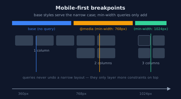
min-width query only adds constraints on top, so nothing is ever "undone".- Design the smallest layout first — single column, full-width components.
- Make spacing and type work at 360px before adding any query.
- Add
@media (min-width: …)blocks to enhance for larger screens. - Test on real devices, not only resized desktop windows (touch, URL bars, safe areas).
max-width queries invert the flow: desktop styles become the default and every smaller
screen accumulates overrides — the "undo" style of authoring that produces sprawling stylesheets.
The canonical pattern
/* Base styles: mobile - no query at all */
.layout {
  display: grid;
  grid-template-columns: 1fr;
  gap: 1rem;
}

/* Tablet and up: enhance */
@media (min-width: 48em) {
  .layout { grid-template-columns: 1fr 1fr; }
}

/* Desktop and up: enhance further */
@media (min-width: 64em) {
  .layout { grid-template-columns: 2fr 1fr; }
}
Note the em units in the queries: browser zoom scales everything together, and a rem-based
layout stays consistent when the user raises their base font size — pixel breakpoints do not.
Fluid sizing
Prefer intrinsic sizing to breakpoints
Many layouts need no queries at all: min()/max()/clamp() and
auto-fit grids adapt continuously (see the Values and Grid lessons).
Reserve media queries for structural changes — navigation reordering, showing a sidebar — and
let components handle their own width fluidly.
/* Container width: fluid with a ceiling, no query */
.page { width: min(92%, 72rem); margin-inline: auto; }

/* Type that scales with the viewport but respects the user's base size */
h1 { font-size: clamp(1.5rem, 1rem + 2.5vw, 2.5rem); }

/* Images never overflow their container - the classic reset line */
img { max-width: 100%; height: auto; }
Media queries beyond width
/* Prefer reduced motion: respected by OS and browser settings */
@media (prefers-reduced-motion: reduce) {
  *, *::before, *::after {
    animation-duration: 0.01ms !important;
    transition-duration: 0.01ms !important;
  }
}

/* Print: hide chrome, expand content */
@media print {
  nav, aside { display: none; }
}

/* The viewport meta tag is REQUIRED for any of this to work on phones:
   <meta name="viewport" content="width=device-width, initial-scale=1"> */
The responsive checklist
| Check | Target |
|---|---|
| Touch targets | At least 44 × 44 CSS pixels (WCAG 2.5.8) |
| Body text size | At least 1rem — the user's own setting |
| No horizontal scroll | At 320px and 360px widths, not just 375px |
| Image behavior | max-width: 100% and explicit dimensions |
| Landscape phones | Content readable with the URL bar collapsed (dvh) |
Practice: break the layout, then fix it
The task
Open demo/quality/17_responsive_mobile_first.html from the
Lab Examples page. Narrow the preview below 360px and
observe which parts hold and which break, then fix the breakage with fluid units.
The checklist
- Convert one
max-widthquery to mobile-firstmin-widthform. - Replace a fixed width with
min(…, …)and delete the query it made necessary. - Verify touch target sizes with dev tools' overlay rulers.
- Check the page at 200% browser zoom — a WCAG requirement and a good proxy for unusual devices.