
Selectors and Combinators
The selector family
Three kinds of patterns
Selectors come in three shapes that compose freely. Simple selectors match one
characteristic of an element (its type, class, ID, attribute, or state). Combinators
describe relationships between elements (descendant, child, sibling). Pseudo-classes and
pseudo-elements match states and generated boxes that have no node in the markup. A real-world
selector chains all three: nav.menu > li:hover::after.
Why selector choice is an architecture decision
Choosing #submit-btn versus .btn-primary is not a style preference. IDs make
rules nearly impossible to override later (highest specificity); classes compose and re-use; element
selectors style patterns globally. Teams converge on class-based selectors precisely because they keep
specificity predictable — a theme explored fully in the Architecture lesson.
Simple selectors
Type, class, and ID
/* Type: every element of that kind - specificity 0-0-1 */
p { line-height: 1.6; }

/* Class: every element carrying the class - 0-1-0.
   The workhorse: reusable, composable, overridable. */
.card { border-radius: 8px; }

/* ID: exactly one element - 1-0-0.
   Valid but rarely desirable: hard to override, cannot repeat. */
#site-nav { border-bottom: 1px solid #334155; }

/* Compound: element AND class together - 0-1-1.
   No space between the parts: both must match the same element. */
p.lead { font-size: 1.125rem; }
Universal and attribute selectors
/* Universal: everything - 0-0-0. Most useful in the box-sizing reset. */
*, *::before, *::after { box-sizing: border-box; }

/* Attribute presence and exact value - 0-1-0 */
[data-loading] { opacity: 0.6; }              /* has the attribute at all */
input[type="email"] { font-family: inherit; } /* exact attribute value */

/* Substring matches - use sparingly, they couple CSS to naming conventions */
a[href^="https://"]::after { content: " ↗"; } /* starts with */
a[href$=".pdf"]::after { content: " (PDF)"; } /* ends with */
Attribute selectors shine for state stored in markup: [aria-expanded="true"],
[data-theme="dark"], [disabled]. They let the HTML carry state and the CSS
react to it — no class toggling required.
Combinators
The four relationships
| Combinator | Reads as | Matches |
|---|---|---|
A B (space) | B inside A | Any descendant, at any depth |
A > B | B child of A | Direct children only |
A + B | B after A | The immediately following sibling |
A ~ B | B after A | Every following sibling |
/* Descendant: any a inside .nav, however deeply nested.
   Convenient but fragile - an added wrapper changes what it matches. */
.nav a { color: #38bdf8; }

/* Child: only direct children. Survives wrapper changes. */
.nav > li { padding: 0.25rem 0.5rem; }

/* Adjacent sibling: the classic "first paragraph after a heading" pattern.
   Note it styles the SECOND element, not the first. */
h2 + p { font-size: 1.125rem; }

/* General sibling: every label after the first in a fieldset. */
fieldset label ~ label { margin-top: 0.5rem; }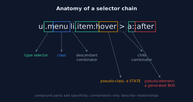
Combinators add, they do not multiply
Each simple selector in the chain contributes its own weight, so .nav > li a is
0-1-2. Long chains are a smell: they usually mean you are reaching across the DOM for styling instead
of marking the element with a class. Keep chains to two or three parts.
Pseudo-classes
Structural: :first-child, :nth-child(), :not()
/* Structural selectors read the DOM shape, not classes or attributes */
li:first-child { border-top: none; }        /* first in its parent */
li:nth-child(odd) { background: #1e293b; }  /* zebra striping without classes */
li:nth-child(3n + 1) { clear: both; }       /* an arithmetic pattern: 1, 4, 7... */
li:last-child { border-bottom: none; }

/* :not() inverts - but its argument still adds specificity */
li:not(:last-child) { border-bottom: 1px solid #334155; }
:nth-child() counts among all siblings; :nth-of-type() counts among
siblings of the same element type. When a list mixes element types, that difference matters.
State: :hover, :focus-visible, :checked, :disabled
/* Interactive states. :focus-visible fires for KEYBOARD focus,
   unlike :focus which also fires on pointer click - the accessible choice. */
.button { background: #2563eb; }
.button:hover { background: #1d4ed8; }
.button:focus-visible {
  outline: 2px solid #93c5fd;
  outline-offset: 2px;   /* never delete the focus indicator without a replacement */
}
.button:disabled { opacity: 0.5; cursor: not-allowed; }

/* Form state lives in the element - the CSS only reacts to it */
input:invalid { border-color: #ef4444; }
input:checked + .price { font-weight: 700; }  /* sibling combinator + state */
Logical: :is(), :where(), and forgiving lists
/* :is() shortens long lists - and takes the specificity of its MOST
   specific argument (here 0-1-0 because of section). */
:is(section, article, aside) h2 { margin-top: 2rem; }

/* :where() is identical but contributes ZERO specificity.
   Ideal for base/default layers you want anything to override. */
:where(figure) img { max-width: 100%; }

/* Forgiving selector list: an invalid entry inside :is() is skipped,
   while the same typo in a plain list would kill the entire rule. */
:is(.menu, .menu..typo) a { text-decoration: none; }
Pseudo-elements
Generated boxes with ::before and ::after
/* ::before / ::after insert a generated child box.
   content is REQUIRED, even when empty. */
.badge::after {
  content: "new";
  background: #ef4444;
  color: #fff;
  font-size: 0.625rem;
  padding: 0.125rem 0.375rem;
  border-radius: 999px;
  margin-inline-start: 0.375rem;
}

/* The empty-content idiom: a purely decorative box, styled entirely in CSS. */
.quote::before {
  content: "";
  display: block;
  width: 2rem;
  border-top: 2px solid #38bdf8;
  margin-bottom: 0.5rem;
}
::marker, ::selection, ::placeholder
/* ::marker styles list bullets/numbers (limited properties apply) */
li::marker { color: #38bdf8; }

/* ::selection styles the text the user highlights */
::selection { background: #1d4ed8; color: #fff; }

/* ::placeholder styles input hint text - keep it readable, never below
   WCAG contrast for the text it replaces */
input::placeholder { color: #64748b; }
Pseudo-elements are real boxes: they take part in layout, can be positioned, and are often the cheapest way to add decoration without adding markup. They are also invisible to accessibility tools — never put meaningful text in one.
Practice: selector workout
The task
Open demo/foundations/02_selector_lab.html and
demo/foundations/03_combinators.html from the
Lab Examples page. For each rendered element, predict
which rule styled it before opening the dev-tools inspector, then verify.
The checklist
- Write one rule for "every other row of a table" without adding classes to the markup.
- Style only the direct labels of a fieldset, however deeply the markup nests later.
- Add a focus style that appears for keyboard users only, using
:focus-visible. - Replace a three-rule font-size override with a single
:where()rule and confirm any later rule now wins regardless of order.