
HTML Accessibility and ARIA
Roughly one person in six lives with a disability, and everyone benefits from accessible markup: captions serve loud environments, semantics serves slow connections, labels serve everyone who has ever forgotten which field a cursor landed in. Accessibility is not a module to add later — it is the quality of your markup measured by a different standard, WCAG.
The accessibility tree
What screen readers actually read
The browser derives an accessibility tree from your DOM: each element contributes a role, a name, and a state. Assistive technology reads that tree — never your tags directly. Two elements can render identically while exposing completely different trees:
<!-- announced as: nothing useful (a plain div) -->
<div onclick="add()">Add to cart</div>

<!-- announced as: button, Add to cart, focusable, Enter/Space work -->
<button type="button">Add to cart</button>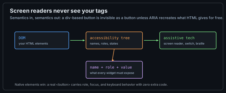
Figure 1 — Assistive technology reads derived semantics, not your source.
Name, role, value
Every interactive element must expose its role (button, link, checkbox), its name (what to call it), and where relevant its value or state (checked, expanded). Native HTML elements provide all three automatically; a div pretending to be a button provides none without ARIA and JavaScript.
Document-level basics: lang and title
The cheapest wins live in the <html> tag: lang chooses the screen reader's pronunciation voice, and the <title> identifies the page in every navigation list. Both are set once per page and influence every screen of the experience.
Keyboard and focus
Tab follows the source order
Keyboard users traverse the page with Tab in DOM order — not visual order. CSS can position anything anywhere, but the tab ring still walks the source. Keep the DOM order logical and most "tabindex management" becomes unnecessary:
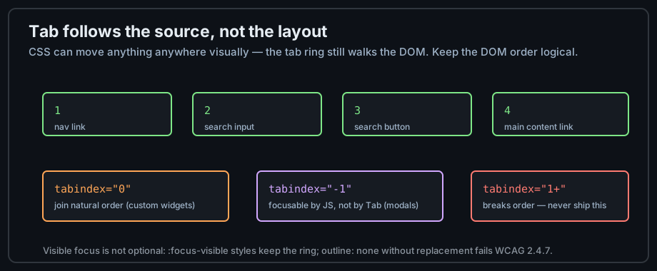
Figure 2 — The tab ring walks the DOM; tabindex 0 joins it, positive values break it.
The tabindex rules
Three values cover everything: tabindex="0" joins the natural order (for custom widgets); tabindex="-1" makes an element programmatically focusable but not tabbable (modals); positive values are always wrong — they break the natural order for everyone.
Visible focus is not optional
outline: none without a replacement removes the only indicator keyboard users have. Style :focus-visible instead — a visible ring that matches your design is all WCAG 2.4.7 asks:
/* replace the ring, never just remove it */
:focus-visible { outline: 3px solid #58a6ff; outline-offset: 2px; }
Labels, alt text, and color
Every input has a label
Chapter 7 covered the mechanics; here is why they matter: an unlabeled field is announced as "edit text" with no hint of purpose. Visible <label> elements are the default; placeholders are hints, never labels.
Alt text quality
Describe the image's role in the page, not its pixels. "Chart of sales doubling" beats "bar chart". Decorative images take alt="" so they vanish from the reading flow — an absent attribute is the worst option because the file name gets read aloud.
Never color alone
Error states marked only by a red border fail users with color vision deficiency (~8% of men). Pair color with an icon, text, or underline. WCAG's contrast minimums (4.5:1 for body text) are checkable with any contrast tool — and zooming to 200% must not break the layout.
ARIA, used wisely
The first rule of ARIA
"Don't use ARIA" — the specification's own joke, with a serious core: native elements beat ARIA replicas because they ship keyboard behavior, roles, and states for free. Reach for ARIA only when no native element exists for the widget:
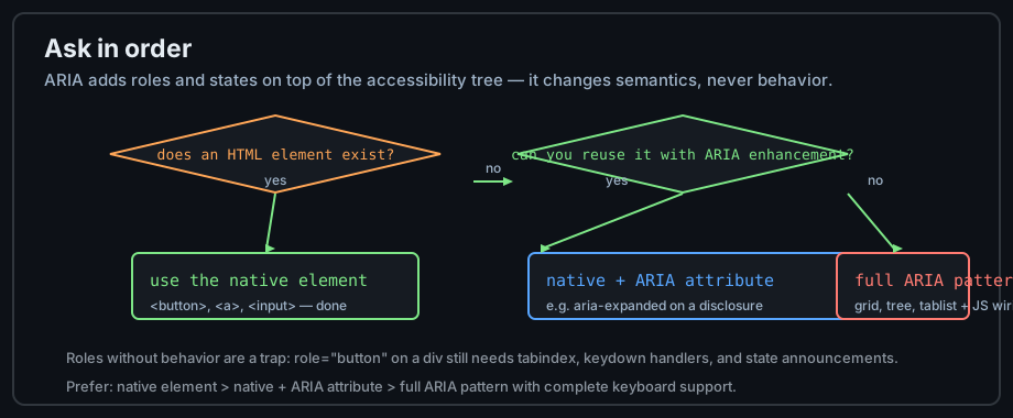
Figure 3 — The ARIA decision flow: native first, patterns last.
The ARIA attributes worth knowing
Three families cover most real use: states (aria-expanded, aria-checked), relationships (aria-labelledby, aria-describedby, aria-controls), and live regions (aria-live announces dynamic updates). They attach semantics; they do not create behavior — the JavaScript to move focus and respond to keys remains yours.
<!-- a disclosure built on a real button: behavior stays native -->
<button aria-expanded="false" aria-controls="panel">Details</button>
<div id="panel" hidden>...</div>
Testing with assistive technology
Turn on VoiceOver (macOS: Cmd+F5) or NVDA (Windows, free) and navigate your own page once a month. The a11y pane in DevTools shows names and roles without audio. Both take minutes and catch what automated tools miss.
Common mistakes
Div buttons
The most damaging single pattern: an unclickable-by-keyboard, unnamed, role-less "button". Use <button>. If the constraint is real (a full ARIA pattern with role, tabindex="0", and keydown handlers), that is the price — not a choice.
Removing focus styles
Global outline: none removes the page from keyboard reachability while looking clean to mouse users. Style the ring; never delete it.
ARIA overload
Sprinkling role="button" on links and aria-label on everything often lowers accessibility by overriding correct native semantics with worse ones. Audit first, add ARIA last.
Practice
Exercises
- Unplug the mouse and complete one full task on your own page — note every place you got stuck.
- Run the page through aXe (browser extension) and fix every reported violation.
- Use the DevTools accessibility pane to verify every interactive element has a name and role.
- Navigate with VoiceOver or NVDA for ten minutes; notice how landmarks and headings become the navigation.
- Check your colors against 4.5:1 contrast, and verify error states do not rely on color alone.
Demo lab
10_accessible_widgets.html in the Lab Examples page contrasts native and ARIA-repaired widgets — view the source, then preview it with keyboard and screen reader.