
HTML APIs and Interactive Markup
data-* for machine-readable values, <template> for inert markup, <dialog> for modals, <details> for disclosures, and custom elements for reusable widgets — no framework required.
"HTML is just static markup" underestimates the platform. These features were added because single-page applications rebuilt their primitives badly; the platform responded with native versions. Learning them first means you will recognize what frameworks are re-implementing — and when plain HTML is simply better.
Data attributes
The contract
Any attribute starting with data- is legal and reserved for application data. It keeps markup valid (no invented attributes), and it is the standard bridge between your HTML and your scripts:
<tr data-product-id="42" data-stock="low">
  <td>Sage seeds</td>
</tr>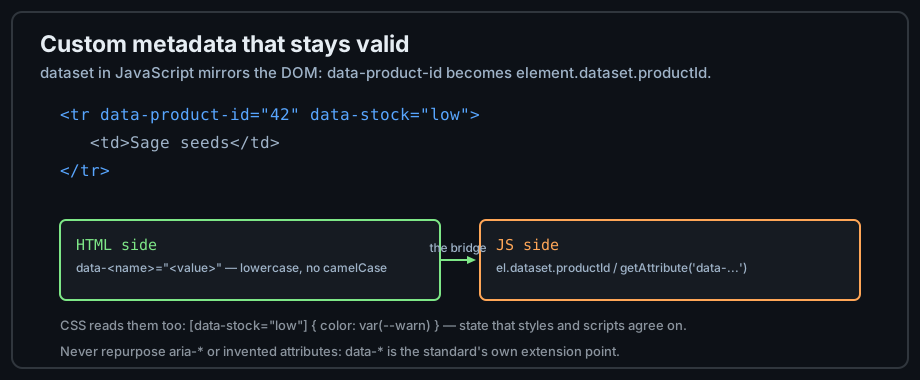
Figure 1 — One attribute naming convention; three consumers.
Reading them in JavaScript
The dataset property mirrors the DOM: data-product-id becomes dataset.productId (camelCase). Writing to it updates the attribute:
const row = document.querySelector('tr');
console.log(row.dataset.productId);   // "42"
row.dataset.stock = 'out';            // sets data-stock="out"
Reading them in CSS
Attribute selectors style by data value — a clean way to encode state that both CSS and JS understand:
[data-stock="low"]  { color: #ffa657; }
[data-stock="out"]  { color: #ff7b72; text-decoration: line-through; }
Inert and collapsible markup
template: markup that waits
<template> holds HTML the browser parses but does not render, fetch images for, or run scripts from. Clone its content to stamp out rows, cards, or list items at runtime — safer than building strings:
<template id="row-tpl">
  <tr><td class="name"></td><td class="qty"></td></tr>
</template>
<script>
  const tpl = document.getElementById('row-tpl');
  const row = tpl.content.cloneNode(true);   // inert until inserted
  row.querySelector('.name').textContent = 'Sage seeds';
  document.querySelector('tbody').append(row);
</script>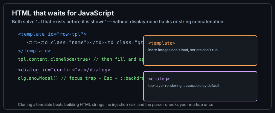
Figure 2 — Two elements for markup that exists before it is shown.
details and summary
Native disclosure — no JavaScript for open/close, keyboard accessible, and styleable. Perfect for FAQs, progressive disclosure, and accordion alternatives:
<details>
  <summary>Do I need a framework for this?</summary>
  <p>No. details and summary are the platform's disclosure widget.</p>
</details>
dialog: the native modal
<dialog> with showModal() gives you a focus-trapped, Escape-dismissing modal with a ::backdrop — the details libraries get wrong, built in:
<dialog id="confirm">
  <p>Delete this item?</p>
  <button id="yes">Delete</button>
  <button id="no">Cancel</button>
</dialog>
<script>
  document.getElementById('confirm').showModal();
</script>
Inline SVG and canvas
Inline SVG: shapes in the DOM
SVG inside HTML is real markup — each shape is a node that CSS can style and JavaScript can bind events to. Icons, charts, and diagrams belong here:
<svg width="24" height="24" viewBox="0 0 24 24" role="img" aria-label="Warning">
  <path d="M12 2 L22 20 H2 Z" fill="#ffa657"/>   <!-- a triangle -->
</svg>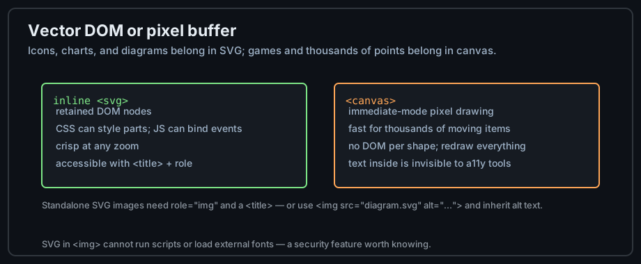
Figure 3 — Retained vector DOM versus immediate-mode pixels.
canvas: pixels on demand
<canvas> is a blank buffer drawn with JavaScript — right for games, particle fields, and anything with thousands of moving elements, wrong for icons and text-heavy visuals:
const ctx = canvas.getContext('2d');
ctx.fillStyle = '#58a6ff';
ctx.fillRect(10, 10, 100, 60);   // nothing retained: redraw everything
Choosing between them
Ask whether assistive technology needs the content (SVG), whether CSS should style parts (SVG), and how many elements animate (canvas wins past ~1000). Hybrid pages use each for what it does best.
Web components
Custom elements
customElements.define() registers a new tag with behavior — reusable widgets with plain-vanilla plumbing:
<sage-rating value="4"></sage-rating>
<script>
  customElements.define('sage-rating', class extends HTMLElement {
    connectedCallback() {
      // render stars from this.getAttribute('value')
      this.textContent = '★'.repeat(+this.getAttribute('value') || 0);
    }
  });
</script>
Shadow DOM: encapsulation
A shadow root gives the element a private DOM and stylesheet scope — page CSS cannot leak in, widget CSS cannot leak out. <slot> projects the page's markup inside:
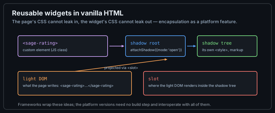
Figure 4 — Custom element, shadow root, and slot projection.
When they are worth it
For a handful of widgets, plain HTML plus a script is simpler. Web components earn their complexity when multiple teams/pages/skills share widgets, or when a design system must work across frameworks — the encapsulation is the product.
Common mistakes
Confusing data-* with aria-*
data-* carries application data; aria-* carries accessibility semantics. Putting state in aria- attributes to style them corrupts what screen readers announce; putting roles in data- attributes hides them from AT. Each has one job.
Building HTML with strings
innerHTML += '<tr>...' + userValue is an injection vector and a parser roulette. Use <template> cloning and textContent — the parser validates the markup once and user data never becomes markup.
Hiding with CSS what should be inert
display: none still downloads images and behaves differently from removal in find-in-page. <template> is for not-yet-real markup; the hidden attribute is for removable content; CSS display is for styling. Pick deliberately.
Practice
Exercises
- Build a table where rows carry
data-*state, styled by CSS attribute selectors and read by one script. - Replace a modal library with
<dialog>+showModal(); test the focus trap and Escape. - Convert a hand-built accordion into
<details>/<summary>and compare the JavaScript line counts. - Draw the same icon inline in SVG and on canvas; inspect both in the accessibility pane.
- Define a
<sage-badge>custom element with a shadow root and a slot.
Demo lab
12_data_attributes.html, 13_details_and_dialog.html, and 14_inline_svg.html in the Lab Examples page demonstrate this chapter — view the sources, then preview each page.