
Images, Figures and Media
<img> and its required alt text, responsive image delivery, the figure pattern, native video and audio, and embedding other documents with iframes.
A page with images is a negotiation with the network: every picture is a separate request, often hundreds of kilobytes. The tools in this chapter — width/height, lazy loading, srcset, modern formats — exist so that pages stay fast while still looking rich.
The img element
The required attributes
<img> is a void element configured entirely by attributes. src names the file; alt gives the text alternative; width and height reserve the layout slot before the image arrives (without them, pages "jump" as images load — layout shift, a Core Web Vitals failure):
<img src="/roadmap/html/img/ledy-bug.png"
     alt="Ladybug on a sage leaf"
     width="320" height="240">  <!-- always both, even though CSS may resize -->
Writing alt text
Alt text is a replacement for the image, not a caption. Ask: what would I say to describe this image's role to someone who cannot see it? Decorative images take an empty alt (alt="") so screen readers skip them entirely; informative images describe their information; images that are links describe their destination:
<!-- informative: describe what it shows -->
<img src="chart.png" alt="Sales doubled between 2024 and 2026">
<!-- decorative: announce nothing -->
<img src="divider.png" alt="">
Choosing a format
Photographs belong in JPEG, WebP, or AVIF; icons, logos, and diagrams belong in SVG or PNG; animations are usually short videos or APNG/WebP. When in doubt: AVIF/WebP first with a fallback, SVG for anything vector-shaped. Chapter 14 sizes these files against the page budget.
Responsive images
The resolution-switching problem
A phone needs a 400-pixel image; a retina laptop needs a 1600-pixel version of the same picture. Shipping one large file to everyone wastes most visitors' bandwidth. srcset offers candidates and sizes describes the layout slot:
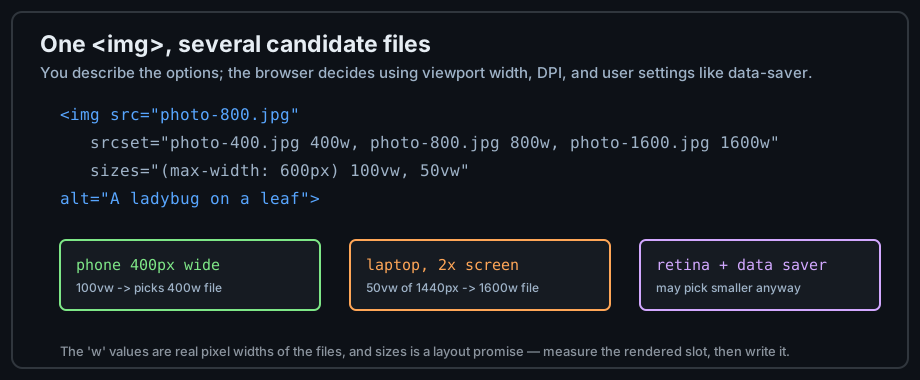
Figure 1 — One img element, several candidate files, browser's choice.
srcset and sizes in practice
The w values are the real pixel widths of the files; sizes is a media-query promise about the rendered slot. The browser combines them with screen density and user settings — you describe options, it decides:
<img src="photo-800.jpg"
     srcset="photo-400.jpg 400w, photo-800.jpg 800w, photo-1600.jpg 1600w"
     sizes="(max-width: 600px) 100vw, 50vw"
     alt="A ladybug on a leaf">
Art direction: picture
When the image content should change — a tight crop on phones, a wide one on desktops, or a modern format where supported — use <picture> with <source> children. The <img> remains mandatory as fallback and alt-text home:
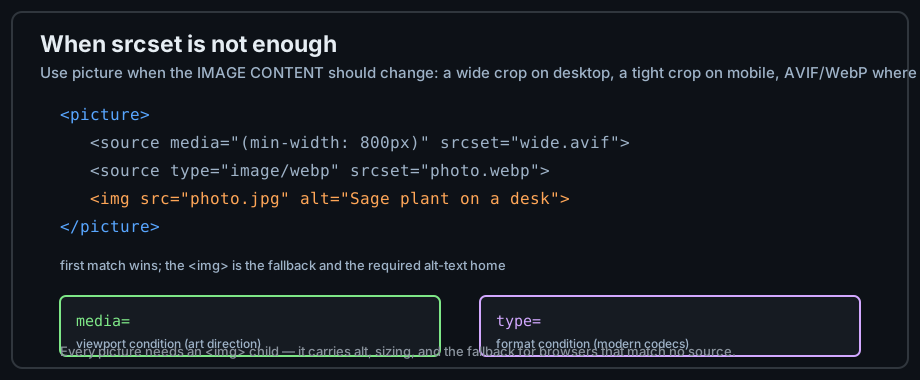
Figure 2 — picture picks by media condition; img is the fallback.
Figures and captions
The figure pattern
<figure> wraps self-contained content — an image, chart, code listing, or table — that the surrounding text references. <figcaption> names it, and screen readers associate the caption with the content:
<figure>
  <img src="bug.png" alt="Ladybug on a sage leaf">
  <figcaption>Figure 2: the garden's best pest control.</figcaption>
</figure>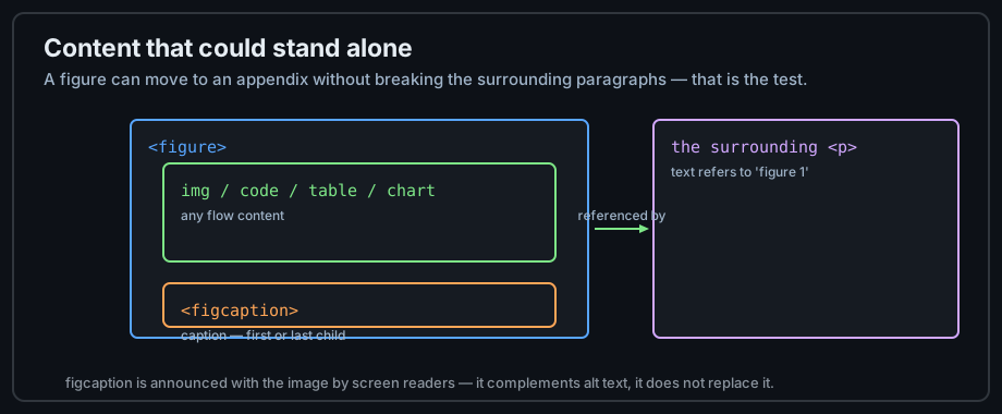
Figure 3 — Content that could stand alone belongs in a figure.
figure versus bare img
Use <figure> when the content is part of the document's argument — the test is whether it could move to an appendix with a caption and still make sense. Inline illustrations that belong inside a sentence are plain <img> elements.
Captions versus alt text
They serve different readers: alt replaces the image for people who cannot see it; figcaption is visible commentary for everyone. Both are worth writing, and neither substitutes for the other.
Video and audio
The video element
<video> plays video with the browser's own player — no plugin. Give it controls (otherwise there is no UI at all), a poster, and a <track> for captions, which are both an accessibility standard and a legal requirement in many contexts:
<video controls width="640" height="360" poster="cover.jpg">
  <source src="clip.webm" type="video/webm">  <!-- modern, smaller -->
  <source src="clip.mp4" type="video/mp4">    <!-- compatibility fallback -->
  <track src="subs-en.vtt" kind="captions" srclang="en" label="English">
  Your browser does not support HTML video.   <!-- fallback text -->
</video>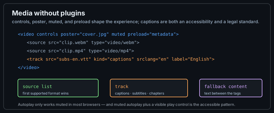
Figure 4 — Native media: sources, tracks, and fallback.
The audio element
<audio> works identically for sound — same controls, same <source> list. Podcast players, pronunciation samples, and notifications are its common uses. Autoplaying audio is hostile and mostly blocked by browsers; design for opt-in playback.
Lazy loading
loading="lazy" on images and iframes defers the fetch until the element nears the viewport. Use it for below-the-fold media only — above-the-fold images should load eagerly, or you delay the one thing the visitor came for:
<img src="photo-13.jpg" alt="Thirteenth garden bed" loading="lazy" width="320" height="240">Embedding other documents: iframes
What an iframe is
<iframe> embeds a complete second browsing context inside your page — maps, videos, embeddable widgets. Its content runs in its own origin; it cannot see your DOM unless you allow it (chapter 15 covers the security model in full).
<iframe src="https://www.openstreetmap.org/export/embed.html?bbox=..."
        width="600" height="450" loading="lazy"
        title="Map of the Sage-Code office"></iframe>
iframes need titles
Without a title, every frame is announced identically as "iframe". The title should name the embedded content: "Map of the office", "Booking widget", "Video player: chapter 3".
When to embed and when not to
Embed when the content is genuinely a separate application (a map, a player, a code sandbox). Copy content into your own page when you just want to show it — an embedded page of text is a slower, less accessible copy of HTML you could have written yourself.
Common mistakes
Missing alt text
The single most common accessibility failure on the web. Every informative image needs alt text; every decorative image needs alt="" explicitly — an absent attribute makes screen readers read the file name, which is worse than nothing.
No width and height
Without reserved dimensions, the page reflows as images arrive — the "layout shift" that makes slow pages unusable and Core Web Vitals scores collapse. Two attributes, set once, prevent the whole class of bug.
Giant unoptimized images
A 6000-pixel camera original displayed at 320 pixels still downloads at full size. Resize to the largest displayed width, compress, serve modern formats — or use srcset so the browser can pick. Chapter 14 turns this into a checklist.
Practice
Exercises
- Add three images to a page: one informative with descriptive alt, one decorative with empty alt, and one linked image whose alt names the destination.
- Give every image width and height, then watch the network tab with caching disabled — note which files dominate.
- Write a srcset for a three-size image and test at phone, tablet, and desktop widths in DevTools device mode.
- Build a
<figure>with figcaption for one image, then read the page with a screen reader (or VoiceOver on macOS) and hear how caption and alt differ. - Embed a map or video iframe with title and
loading="lazy".
Demo lab
05_images_and_figure.html in the Lab Examples page shows alt-text styles and the figure pattern — view the source, then preview the page.